| Summary: | Make toolbar customizable | ||
|---|---|---|---|
| Product: | [Applications] Spectacle | Reporter: | popov895 <popov895> |
| Component: | General | Assignee: | Noah Davis <noahadvs> |
| Status: | CONFIRMED --- | ||
| Severity: | wishlist | CC: | 4wy78uwh, adam.m.fontenot+kde, andy, kde, nate, popov895 |
| Priority: | NOR | ||
| Version First Reported In: | 23.04.0 | ||
| Target Milestone: | --- | ||
| Platform: | Other | ||
| OS: | Linux | ||
| Latest Commit: | Version Fixed/Implemented In: | ||
| Sentry Crash Report: | |||
|
Description
popov895
2023-05-02 18:22:16 UTC
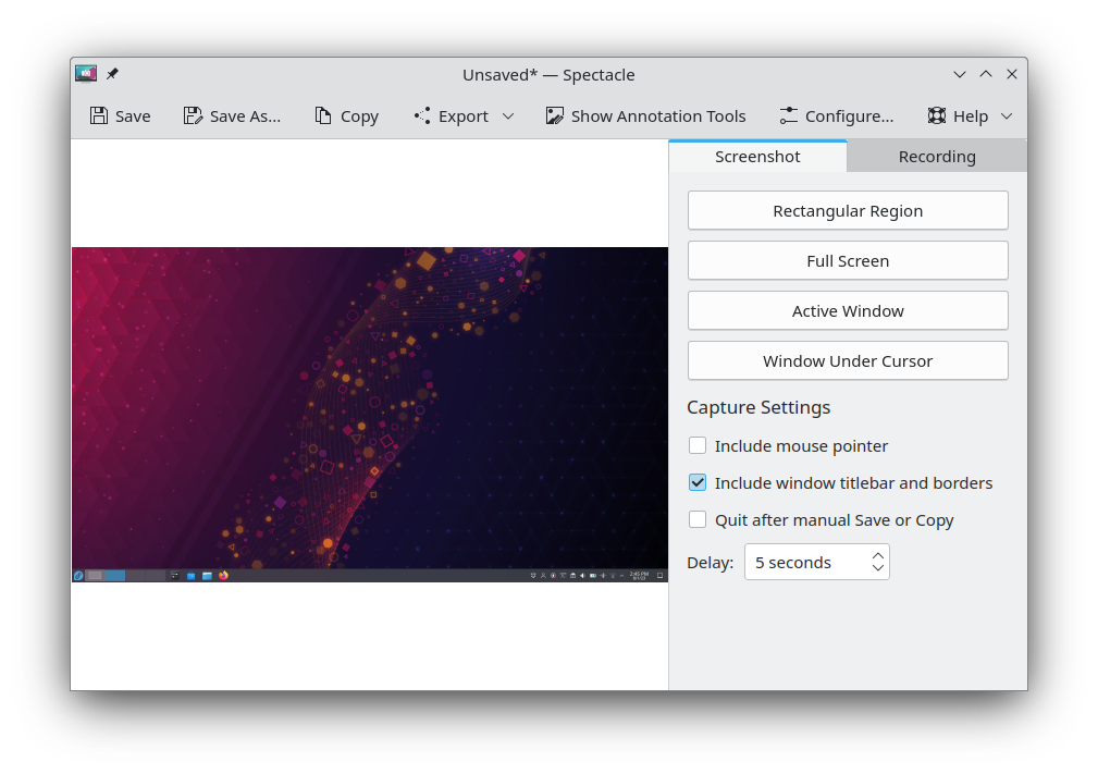
We currently don't have a shared mechanism for allowing toolbar button display style (icon-only/text-only/text beside icon/text under icon) to be customized for Qt Quick UIs, which is why most Qt Quick UIs don't allow customizing that, but it would probably be nice to have in the future. Perhaps it could be done in qqc2-desktop-style. FWIW the icon/text setting in System Settings is most likely going to be going away in Plasma 6, so I don't think there's much a chance of anything being changed in Spectacle to support it. (In reply to Nate Graham from comment #2) > FWIW the icon/text setting in System Settings is most likely going to be going away in Plasma 6 Hmm, what's the reason? (In reply to popov895 from comment #3) > (In reply to Nate Graham from comment #2) > > FWIW the icon/text setting in System Settings is most likely going to be going away in Plasma 6 > > Hmm, what's the reason? See https://invent.kde.org/plasma/plasma-desktop/-/issues/59 BTW why did you choose to use Qt Quick? The same UI can easily be made using Qt Widgets. The goal was to integrate a recording library which had a UI that was QtQuick-only. And in general we've been porting our UIs to QtQuick to make them more maintainable going forward and more attractive to newer developers and experienced developers with experience with declarative UI building on other platforms. The floating toolbars and animations would have been extremely difficult to do in Qt Widgets. (In reply to popov895 from comment #0) > All KDE applications that use toolbars have tools to customize those > toolbars. Please use the same approach for the Spectacle. Also, the toolbar > always shows button labels, even if my system settings are set to show icons > only. I was about to make a bug for this, because with the 6.4 changes I definitely wanted the option to modify the toolbar, as it's now rather strange and inconsistent. All the buttons on the toolbar use labels, except for Save, Save As, and Copy. This is confusing, because these three icons aren't easy to visually distinguish. Also, the layout and spacing is awkward. Save, Save As, Copy, Export, and Edit are all grouped together, which makes sense. But New Screenshot and New Recording are on the same toolbar, which makes a bit less sense, and moreover Options is grouped with these two buttons, which doesn't make much sense at all. I'd really love the ability to be able to add a button to take a rectangular selection screenshot back to the toolbar. The 6.3 UX handled this in one click (thanks to the nifty side panel), and now it's unfortunately buried under a menu. Happy to make separate reports for any of this if it would help someone. We don't yet have a customizable toolbar component in Kirigami, but it's on the long-term roadmap. However until we get that, let's try to dig into what's making you want to customize it. Would it make sense if the actions were arranged in more of a "progression of how you use the app" order? e.g.: - New Screenshot menu - New Screen Recording menu - Edit… - Copy - Save/Save as (potentially these could be combined into a Split button, as the really old QtWidgets-based Spectacle had) - Export - [expanding spacer] - Options (In reply to Nate Graham from comment #9) > However until we get that, let's try to dig into what's making you want to > customize it. Good question. I'm happy to raise these issues elsewhere like on the Gitlab if there's a good place for them. If I were able to edit the toolbar, I would do so with an eye to accomplishing the following things: 1. Trying to put the buttons in a logical order. I think your proposed order is a pretty good one, but I think the question is connected to the philosophical issue of whether Spectacle is more like a one-off utility for taking screenshots or more like an image editor that happens to take screenshots. The current layout tries and mostly fails to be an editor. The right way to do this would not just be the "order of operations" - rather you'd want to implementing the UX the users are used to from other editors. That means you have file operations - new, save, export, then you have editor operations, then you have other stuff. LibreOffice Writer uses this, for instance. The partial "half-editor" feeling of 6.4 is apparent when you click "Edit" - the whole toolbar awkwardly shifts to one side put "undo" and "redo" before the file operations (save, etc). But I'm not sure that I buy that Spectacle really is (or ought to be) an "editor" or a program that does "file operations". I think the previous interface (6.3) had a nice separation of concerns in that the true primary operations of Spectacle were presented front and center with all the relevant options visible, and secondary operations were demoted to the toolbar: https://cdn.kde.org/screenshots/spectacle/spectacle.png There's something that feels right about that to me, even though there certainly valid points of criticism for 6.3's UX. 2. Adding / placing buttons that will give immediate access to the most important Spectacle operations, like creating a rectangular selection screenshot. As of 6.4 this has been demoted to a menu, meaning it takes more clicks to do the things that users rely on Spectacle for the most. This also resulted in issues like Bug 505803 that require awkward workarounds like "disable the menu animations in Spectacle". 3. Flipping the use of labels for uncommon operations and the hiding of labels for the most common operations. "Save" and "Save As" are nearly identical icons. Copy is not particularly visually distinct for an operation that is more about sending a screenshot to the clipboard (the universal "PrintScr" operation) than it is "copying" a file. Instead we have "Export" with a huge menu, and Options is labeled as well. I'm not a UI designer, so getting at "why" is above my paygrade, but I'll also just say that the aesthetics of this seem really terrible to me: https://0x0.st/8lON.png 4. (This isn't something that editing the toolbar would fix, but...) The fact that "Options" leads to a dropdown menu where you change the parameters for screenshots and recordings is *really* terrible UX, in my opinion. It's not particularly discoverable (I expected it to be options for Spectacle as a program, not options for screenshots), and requires still more clicks to change stuff like "delay" that I use constantly. Spectacle is definitely not intended to be an image editor with screenshot capabilities, and I don't think it makes sens to try to turn it into that. I think your concerns here with Spectacle's UX overhaul in Plasma 6.4 are deeper and would not actually be addressed by making the toolbar customizable. This is probably worth discussing separately, but elsewhere. > I was about to make a bug for this, because with the 6.4 changes I definitely wanted the option to modify the toolbar, as it's now rather strange and inconsistent. All the buttons on the toolbar use labels, except for Save, Save As, and Copy. This is confusing, because these three icons aren't easy to visually distinguish.
This has definitely been confusing. The most important button is "Copy", which used to be easy to identify and click. I thought I was going crazy a few times wondering where the button went. A bigger button to make it an easy target and with a label is worth the screen real estate IMO.
|