| Summary: | Move Taskmanager background highlight bar to the opposite side | ||
|---|---|---|---|
| Product: | [Plasma] plasmashell | Reporter: | Claudius Ellsel <claudius.ellsel> |
| Component: | Theme - Breeze | Assignee: | visual-bugs-null |
| Status: | RESOLVED INTENTIONAL | ||
| Severity: | wishlist | CC: | carl, nate, plasma-bugs-null |
| Priority: | NOR | ||
| Version First Reported In: | 5.19.5 | ||
| Target Milestone: | 1.0 | ||
| Platform: | Other | ||
| OS: | Linux | ||
| Latest Commit: | Version Fixed/Implemented In: | ||
| Sentry Crash Report: | |||
| Attachments: |
Taskmanager highlight bar
Other planned UI element for Breeze where the highlight bar is on the "correct" side Google search results GitLab sidebar Website using the same style as "Plasma panel" |
||
Created attachment 131964 [details]
Other planned UI element for Breeze where the highlight bar is on the "correct" side
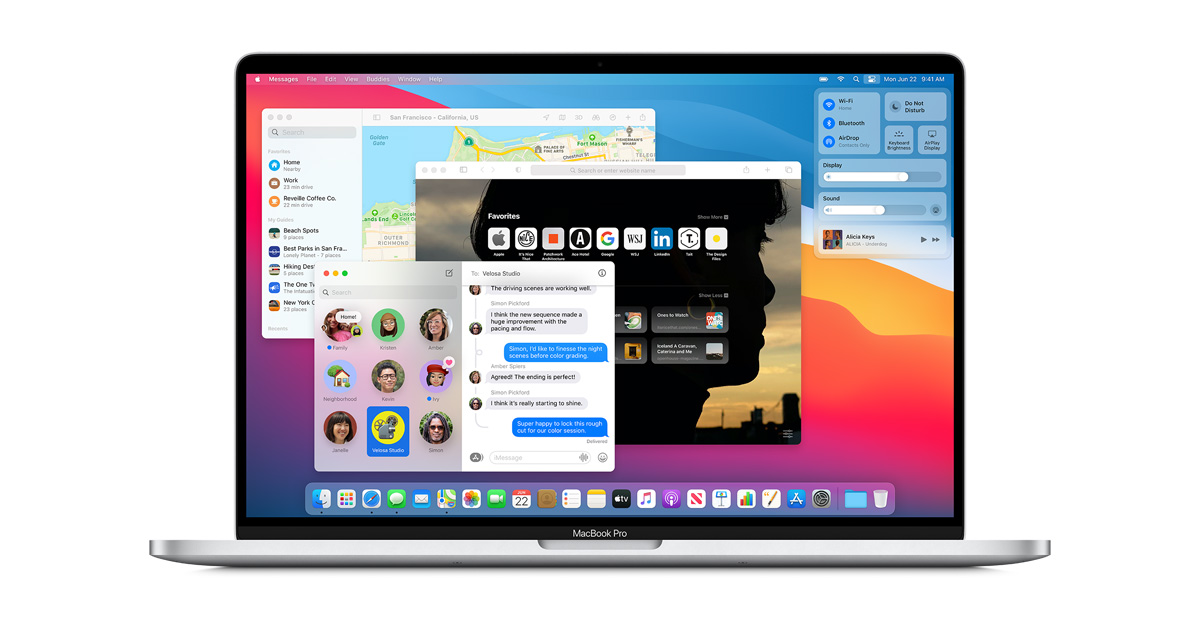
I guess this is the relevant file: https://invent.kde.org/frameworks/plasma-framework/-/blob/master/src/desktoptheme/breeze/widgets/tasks.svg Some more examples: - Windows: https://upload.wikimedia.org/wikipedia/commons/7/7f/Windows10abstract.png - macOS (using a dot): https://www.apple.com/newsroom/images/product/os/macos/standard/apple_macos-bigsur_redesignedapps_06222020_LP_hero.jpg.og.jpg - Ubuntu (also using a dot): https://www.heise.de/select/ct/2020/11/2004417164885784825/u20_aufmacher_ubuntu.com.png One instance I just discovered not following it is the Google search - see attachement (but that is for an element in between two other elements, not one on the edge of the window or screen). Created attachment 131965 [details]
Google search results
Created attachment 131966 [details]
GitLab sidebar
I don't agree, I like the current design because the bar points to the content when the window is show and there is no bar when the window is minimized. Also because other are doing it, is not a strong argument and we are not in the buisness of creating a Windows clone. (In reply to Carl Schwan from comment #6) > I don't agree, I like the current design because the bar points to the > content when the window is show and there is no bar when the window is > minimized. Also because other are doing it, is not a strong argument and we > are not in the buisness of creating a Windows clone. Users don't expect such bars pointing towards content. This is inconsistent with every UI I know of. I might be wrong, so I am seriously interested in examples where the opposite is the case. Also see https://lawsofux.com/jakobs-law. And no, this is not about creating a Windows clone. It is about offering a UI that looks how the user expects it to look. Changing the direction of the highligh breaks the Jakobs law with many of our tabs: * Kickoff use highlight on top * Firefox use highlight on top * We have plans for breeze to have highligh on top: https://invent.kde.org/plasma/breeze/-/merge_requests/6 The opposite is the case. The tabs use highlights on top, because the content is below. That is the principle I am talking about. Have the bar on the opposite side of the content. Also like the vertical bars on the KDE and GitLab example. (In reply to Carl Schwan from comment #8) > * Kickoff use highlight on top Did not consider this. This is true, although a bit different use case. Also I saw that Konsole uses colored bars underneath the text of tabs (https://invent.kde.org/plasma/breeze/-/merge_requests/6#note_54468). For tabs using a bar underneath does seem a bit more common, though - also see the Google search example. In the Konsole case one other thing might be that the bars are rather used for tagging than highlighting (they are always visible), so that might be not that comparable. Let's get one thing clear: this is no way a usability thing; the *positioning* of the indicator being closer to the content or farther from the content is purely aesthetic. It appears that you are objecting to the closer-to-the-content positioning on the basis that: "This is not consistent with any other UI I can think of." "It does not feel natural." "Users don't expect such bars pointing towards content." And then you provide visual examples from Windows, macOS, and Ubuntu, showing that the indicator (which is sometimes a line, and sometimes a dot) is farther from the content. If a difference from other platforms poses a usability problem, then it is worth addressing. But is there actually a usability problem here? This seems like a purely aesthetic thing to me. So other than simply being different from what other platforms do, is there actually a *problem* here? (In reply to Nate Graham from comment #11) > Let's get one thing clear: this is no way a usability thing; the > *positioning* of the indicator being closer to the content or farther from > the content is purely aesthetic. This is only your interpretation. Please don't present it like a fact. Also I did not say it has to do with usability, but that it does likely not feel natural to users. > And then you provide visual examples from Windows, macOS, and Ubuntu, > showing that the indicator (which is sometimes a line, and sometimes a dot) > is farther from the content. See the attachements. I also gave examples from a planned KDE design and GitLab for vertical bars. There are many more. > But is there actually a usability problem here? Well above you said "no way". Also note I did not mark it as a bug, but as "wishlist". So if there is no problem to be solved why should we change it? I get that you want the indicator to be located in the place where it is located in other platforms. But *why?* Simply because it's a good thing to be consistent with what other platforms are doing? Or are there any other reasons? (In reply to Nate Graham from comment #13) > So if there is no problem to be solved why should we change it? I think there is a problem. Normally the highlight indicator tends to be the opposite side of the content. That way people know where the content is. It is a visual clue. If it is not thought as a clue, people probably learn to interpret it that way anyway. At least I did. And there are other people stating that it does not feel "natural" to them the way it is on KDE. But that does not say much. Either they also expect indicators being used in a different way because it is a common practice or that is just their personal preference. > I get that you want the indicator to be located in the place where it is > located in other platforms. But *why?* Simply because it's a good thing to > be consistent with what other platforms are doing? Or are there any other > reasons? As I outlined above, I think there is a chance people are taking those indicators as visual clues. One other thing not counting as an argument is that probably there is a reason why designers tend to use those indicators the way they use them. Maybe the indicator acts like a wall repelling the eye and pointing it to the content on the opposite side or something like that. They might also have done user studies to find out what users prefer. But that is all just speculating, so I don't expect you to address those concerns. So in essence, you suspect that other platforms are doing it differently for good reasons, even if you don't know what those reasons are, and that accordingly, users are accustomed to the opposite style, rather than ours. Is that accurate? (In reply to Nate Graham from comment #15) > So in essence, you suspect that other platforms are doing it differently for > good reasons, even if you don't know what those reasons are, and that > accordingly, users are accustomed to the opposite style, rather than ours. > > Is that accurate? The main argument was that users are probably accustomed to the opposite style, yes. Other arguments include that there might be good other reasons why the opposite style is used that extensively and that "Plasma" itself uses this opposite style for the highlight of list (?) items - see the attachment. > Other arguments include that there might be good other reasons why the > opposite style is used that extensively and that "Plasma" itself uses this > opposite style for the highlight of list (?) items - see the attachment. If we don't know the reason, then we'd be blindly copying them on the assumption that they're right and we're wrong. Without concrete evidence that it is actually better, "everyone else is doing it" isn't a valid reason. (In reply to Claudius Ellsel from comment #16) > The main argument was that users are probably accustomed to the opposite > style, yes. Got it. So this would be the "user familiarity" argument. While there is an inherent Jakob's Law argument that consistency with what people are familiar with is good, this only goes so far; it cannot be taken to its logical conclusion that even minor aesthetic choices must be copied, or else we will be drawn to copy 100% of Windows or Android or whatever just because it's probably what everyone else is familiar with. This makes us a cheap and inferior copy and there is no reason not to simply use the original instead. See also https://community.kde.org/Get_Involved/Design/Lessons_Learned#Copying_Apple I don't think this very minor aesthetic thing is worth changing. If you disagree and prefer the opposite style where the indicator bar is far from the content area rather than close to it, you're welcome to create a Plasma theme that does so. That's why we have theming: so that people who don't agree with the default aesthetic choices can self-satisfy. Who knows, maybe it will be so popular that lots of people will start using it and distros will ship it by default and we'll be encouraged to accept the change. Stranger things have happened. :) (In reply to Nate Graham from comment #17) > > Other arguments include that there might be good other reasons why the > > opposite style is used that extensively and that "Plasma" itself uses this > > opposite style for the highlight of list (?) items - see the attachment. > If we don't know the reason, then we'd be blindly copying them on the > assumption that they're right and we're wrong. Without concrete evidence > that it is actually better, "everyone else is doing it" isn't a valid reason. It would be some kind of educated guessing, so not exactly blindly. But I totally understand your point and that is why I didn't want to present it to you as an argument in the first place (I hope I made that clear). You did not address the argument that it is currently proposed to use that style for selecting things in sidebars like dolphin for Breeze. > (In reply to Claudius Ellsel from comment #16) > > The main argument was that users are probably accustomed to the opposite > > style, yes. > Got it. So this would be the "user familiarity" argument. > > > While there is an inherent Jakob's Law argument that consistency with what > people are familiar with is good, this only goes so far; it cannot be taken > to its logical conclusion that even minor aesthetic choices must be copied, > or else we will be drawn to copy 100% of Windows or Android or whatever just > because it's probably what everyone else is familiar with. This makes us a > cheap and inferior copy and there is no reason not to simply use the > original instead. See also > https://community.kde.org/Get_Involved/Design/Lessons_Learned#Copying_Apple Understood. I'd argue that it is not about copying them, but to use the common style for selection highlighting which is not only used by Windows, but all over the place as I hopefully layed out quite exhaustively. So stating this would result in a copy of any specific thing is not justified by that argumentation I think. To me this still feels like some design principle and not just an aesthetic choice (but that are my feelings not really backed by hard facts). Arguing that this is some minor thing might be true, though. > I don't think this very minor aesthetic thing is worth changing. If you > disagree and prefer the opposite style where the indicator bar is far from > the content area rather than close to it, you're welcome to create a Plasma > theme that does so. That's why we have theming: so that people who don't > agree with the default aesthetic choices can self-satisfy. Who knows, maybe > it will be so popular that lots of people will start using it and distros > will ship it by default and we'll be encouraged to accept the change. > Stranger things have happened. :) I don't like moving away from upstream in general. My approach is to improve upstream. But I see that this is not broadly seen as an improvement, fair enough. On a side note (not sure whether this is true it seems to be only a rough eastimation), a person on your blog complaining about this stated that 99% of Plasma themes have the highlight on the other side than the default. Created attachment 131986 [details] Website using the same style as "Plasma panel" Today by accident I saw a webpage using the "Plasma" style for that kind of highlighting: https://ant.design/docs/react/introduce. Adding as attachement for the sake of completeness. |
Created attachment 131963 [details]
Taskmanager highlight bar

SUMMARY
The highlight bar of the Taskmanager is on the side towards the content. This is not consistent with any other UI I can think of. It does not feel natural. Thus I suggest to switch the sides.