| Summary: | A lot of unused space between icons in the panel | ||
|---|---|---|---|
| Product: | [Plasma] plasmashell | Reporter: | Nick Stefanov <mo78> |
| Component: | Panel | Assignee: | Plasma Bugs List <plasma-bugs-null> |
| Status: | RESOLVED WORKSFORME | ||
| Severity: | wishlist | CC: | andreas_k, kde |
| Priority: | NOR | Keywords: | triaged |
| Version First Reported In: | 5.4.1 | Flags: | kde:
VisualDesign+
|
| Target Milestone: | 1.0 | ||
| Platform: | Arch Linux | ||
| OS: | Linux | ||
| URL: | http://store.picbg.net/pubpic/5B/F6/caf0ce2944ba5bf6.jpg | ||
| Latest Commit: | Version Fixed/Implemented In: | ||
| Sentry Crash Report: | |||
| Attachments: | qucklaunch in breeze | ||
|
Description
Nick Stefanov
2015-09-29 19:22:44 UTC
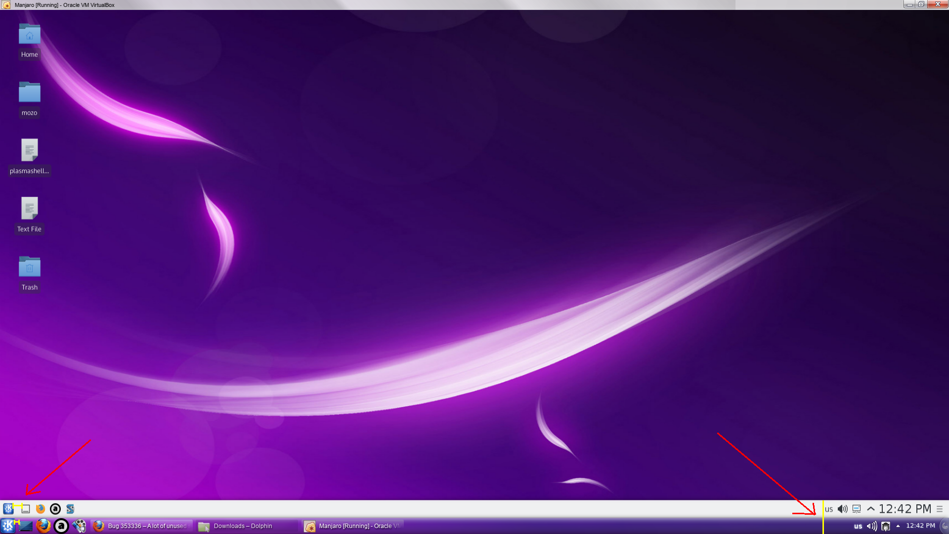
If it's unclear, I mean icons in the "Quick launch" area and I marked them with yellow lines. Same goes for the "systray", but the "Quick launch" is most important for me. It would be great to add font size option for the clock and size of the objects in the "systray" area too. Thank you in advance :) Created attachment 94793 [details]
qucklaunch in breeze
Hi,
first I think the quick launch is still a bit new and buggy (it crashed quite often). But about the space.
As Plasma 5 support only Breeze can you please add an screenshot with the Breeze or Breeze-dark theme.
At my Installation I get the quick launch icon too what I miss in your screenshot. The File manager and konsole icons are from the quick launch and the system setting icon is from the icon task manager. The space between each application icon is the same.
marking as waiting for screenshot In breeze icons is smaller but the gapes are the same which isn't a soluition: http://store.picbg.net/pubpic/16/84/fad16fb0f4d11684.png Huge, huge space loss. The space between the icons is the same, clearly the issue in the screenshot is the font size of the clock. Reduce its size. http://i.imgur.com/VhkuUqq.png - Breeze http://i.imgur.com/N3aePos.png - Oxygen Your issue with the icons in the quick launch area is about the padding in the Plasma theme. Different theme, different padding. The Plasma theme also changes the font size, the clock size in the Oxygen theme is clearly smaller (like your screenshot shows). So just FYI, it's not about the icons. Clearly this is not the issue: http://store.picbg.net/pubpic/FC/51/55acc424c515fc51.jpg How does the clock's font size actually affect the icons in the quick launch? And where is the option to set clock font size? The only way is to choose some of the ClearlyU fonts. The problem is spacing. Neither icons, nor theme. It's obvious. The name of the issue also says it: "A lot of unused SPACE between icons in the panel" Where I wrote something about theme or icons? It's spacing. I'm showing this with yellow lines. Same theme, same icons, different spacing. I'm explaining to you why there's a difference in spacing, and why it happens. But here it is again: http://store.picbg.net/pubpic/16/84/fad16fb0f4d11684.png - here in the system tray you see that the clock font is larger in Breeze than the font size used in whatever theme is being used below that. Making the font size smaller would fix that. Being that it's not possible yet in Plasma 5 to change that setting at least not from the GUI like before (I thought it was) then the Plasma theme can set the size of the font to be smaller so the space is better utilized there. So the Breeze theme would use a smaller size for the clock and thus fixing that problem. And the space between the start menu icon (KDE logo) and the quick launch icons comes from the Plasma theme's background SVG files. That's why I said different themes have different padding. Each theme uses different background SVG files and they are made different. Whatever plasma theme you're using (transparent one) also makes the graphic elements like the menu and quick launch icons larger unlike Breeze, obviously, there's going to be less space between them each graphic when you measure that. In all themes it is the same. How many screenshots I must give? Let talk for quick launch - in all themes there is different icon sizes but the spacing between them is always the same. The spacing between icons. We talk just for this. I already gave you a screenshot with smaller clock font: http://store.picbg.net/pubpic/FC/51/55acc424c515fc51.jpg But I repeat again - we talk here mostly for quick launch and the clock doesn't affect it in aniway. Hello, anybody? Can someone provide me the config file which is responsible for this spacing to edit it manually for it's obvious you don't care? Dear Bug Submitter, This bug has been in NEEDSINFO status with no change for at least 15 days. Please provide the requested information as soon as possible and set the bug status as REPORTED. Due to regular bug tracker maintenance, if the bug is still in NEEDSINFO status with no change in 30 days, the bug will be closed as RESOLVED > WORKSFORME due to lack of needed information. For more information about our bug triaging procedures please read the wiki located here: https://community.kde.org/Guidelines_and_HOWTOs/Bug_triaging If you have already provided the requested information, please set the bug status as REPORTED so that the KDE team knows that the bug is ready to be confirmed. Thank you for helping us make KDE software even better for everyone! Dear Bug Submitter, This bug has been in NEEDSINFO status with no change for at least 30 days. The bug is now closed as RESOLVED > WORKSFORME due to lack of needed information. For more information about our bug triaging procedures please read the wiki located here: https://community.kde.org/Guidelines_and_HOWTOs/Bug_triaging Thank you for helping us make KDE software even better for everyone! |